On 10 November 2022, DHSC posted a tweet about nurses’ pay, after the Royal College of Nursing announced the result of its ballot on strike action. The tweet included a graphical representation of increases in nurses’ pay over the past three years.
The tweet received comments from online followers asking for more information on the figures used; the department is publishing this blog to provide this.
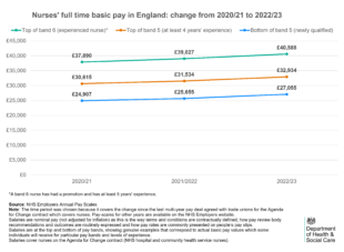
- The data used in this chart on NHS pay scales is published by NHS Employers (2020/21, 2021/22 and 2022/23). NHS Employers is responsible for updating and publishing pay scales when changes are made and is the definitive source on terms and conditions for NHS staff in England.
- The chart covers the time period from 2020/21 to the latest pay award for 2022/23. This time period includes the change since the last multi-year pay deal agreed with trade unions for the Agenda for Change contract which covers nurses.
- The chart uses nominal values for nurses’ pay, that is, values not adjusted for inflation. This is the way that terms and conditions are contractually defined, how pay review body recommendations and outcomes are routinely expressed, and how pay rates are commonly understood and presented on people’s pay slips.
- The values used in the chart relate to salaries for nurses at the bottom and top of pay bands. Unlike averages, they correspond to actual basic pay values which some individuals will receive for particular pay bands and levels of experience
- Older data and equivalent information for other pay points is available on the NHS Employers website.
- NHS Digital has published more details on the distribution of nurses across the pay bands and across pay system 'spine points'. This information is available here (with information on spine points published by NHS Employer here).
With proportionate distances between the data points on the chart and an axis starting at 0 it would look like:
Recent Comments